button(text?: string): Button;
A generic GUI button component.
Parameters
| Option | Type | Description | Required |
|---|
| text | string | The text of the button | |
Streams
| Name | Type | Description | Hold |
|---|
| $text | string | Stream defining the button text | ✓ |
| $type | 'default' | 'success' | 'warning' | 'danger' | Stream defining the button type | ✓ |
| $click | undefined | Stream of click events | |
| $pressed | boolean | Stream of binary events indicating if the button is pressed | ✓ |
| $loading | boolean | Stream of binary events indicating if the button is in loading mode | ✓ |
| $loading | boolean | Stream of binary events indicating if the button is in loading mode | ✓ |
| $disabled | boolean | Stream defining if the input is disabled. | ✓ |
Screenshot
Example
const capture = button('Hold to record instances');
capture.title = 'Capture instances to the training set';

capture.$click.subscribe((x) => console.log('button $click:', x));
capture.$pressed.subscribe((x) => console.log('button $pressed:', x));
number
number(defaultValue?: number): Number;
A generic GUI number input component.
Parameters
| Option | Type | Description | required |
|---|
| defaultValue | number | Initial value. Defaults to 0. | |
Streams
| Name | Type | Description | Hold |
|---|
| $value | number | Stream defining the input's value | ✓ |
| $disabled | boolean | Stream defining if the input is disabled. | ✓ |
Screenshot
Example
const epochs = number(30);
epochs.title = 'Number of Epochs';

epochs.$value.subscribe(console.log);
numberArray
numberArray(defaultValue?: number[]): NumberArray;
A generic GUI number array input component.
Parameters
| Option | Type | Description | required |
|---|
| defaultValue | number[] | Initial value. Defaults to []. | |
Streams
| Name | Type | Description | Hold |
|---|
| $value | number[] | Stream defining the input's value | ✓ |
| $disabled | boolean | Stream defining if the input is disabled. | ✓ |
Screenshot
Example
const neuronsPerLayer = numberArray([64, 32, 16]);
neuronsPerLayer.title = 'Number of Neurons per Layer';

neuronsPerLayer.$value.subscribe(console.log);
select
select(options: string[], value?: string): Select;
A generic GUI Select component.
Parameters
| Option | Type | Description | Required |
|---|
| options | string[] | The select menu options | ✓ |
| value | string | The default value (by default, the first option) | |
Streams
| Name | Type | Description | Hold |
|---|
| $options | string[] | Stream of menu options | ✓ |
| $value | string | Stream of selected value | ✓ |
Screenshot
Example
const sel = select(['one', 'two', 'three'], 'two');
sel.$value.subscribe((x) => console.log('sel $value:', x));
slider
slider({
  values: number[],
  min: number,
  max: number,
  step: number,
  range: boolean | 'min' | 'max',
  float: boolean,
  vertical: boolean,
  pips: boolean,
  pipstep: number,
  formatter: (x: unknown) => unknown,
  continuous: boolean,
}): Slider;
A generic slider widget, allowing multiple thumbs.
Parameters
| Option | Type | Description | Required | Default |
|---|
| values | number[] | The default values | | [0.2] |
| min | number | minimum value | | 0 |
| max | number | maximum value | | 1 |
| step | number | step size | | 0.01 |
| range | boolean | 'min' | 'max' | Specifies the slider bar display. If false, no bar is displayed. If true, the bar is displayed as a range between several values. If 'min' (resp. 'max'), the slider bar is displayed from the minimum (resp. 'maximum') value. | | 'min' |
| float | boolean | specifies if the value should be displayed in a floating indicator on hover | | true |
| vertical | boolean | display the slider vertically | | false |
| pips | boolean | display pips (ticks) | | false |
| pipstep | number | Pip step size | | undefined |
| formatter | (x: unknown) => unknown | The function used for formatting the pips and floating indicator | | (x) => x |
| continuous | boolean | Specify if values should be update continuously or on mouse release. | | true |
Streams
| Name | Type | Description | Hold |
|---|
| $values | string | Stream of selected value | ✓ |
| $min | string | Stream of selected value | ✓ |
| $max | string | Stream of selected value | ✓ |
| $step | string | Stream of selected value | ✓ |
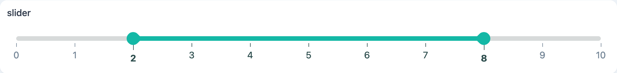
Screenshot
Example
const slider = slider({
  values: [2, 8],
  min: 0,
  max: 10,
  pips: true,
  step: 1,
  range: true,
});
slider.$values.subscribe((x) => console.log('slider $values:', x));
text
text(initial?: string): Text;
A generic GUI text display component accepting HTL strings.
Parameters
| Option | Type | Description | Required |
|---|
| initial | string | Initial text | |
Streams
| Name | Type | Description | Hold |
|---|
| $value | boolean | Stream defining the text content | |
Screenshot
Example
const t = text(
  `Just some HTML text content...<br>
  Accepts HTML: <a href="https://marcelle.dev">Click me!</a>`,
);
textArea
textArea(defaultValue: string, placeholder: string): TextArea;
A generic GUI text area component.
Parameters
| Option | Type | Description | Required |
|---|
| defaultValue | string | Initial value | |
| placeholder | string | Placeholder text | |
Streams
| Name | Type | Description | Hold |
|---|
| $value | string | Stream defining the textarea's value | ✓ |
| $disabled | boolean | Stream defining if the textarea is disabled | ✓ |
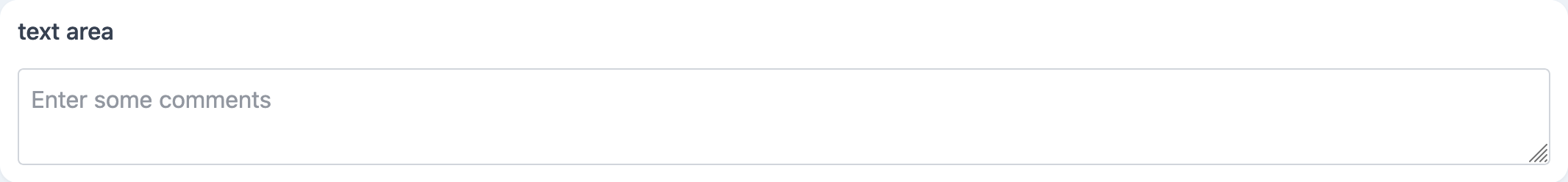
Screenshot
Example
const comments = textArea('', 'Enter some comments');
comments.$value.subscribe(console.log);
textInput
textInput(defaultValue?: string): TextInput;
A generic GUI text input component.
Parameters
| Option | Type | Description | Required |
|---|
| defaultValue | string | Initial value | |
Streams
| Name | Type | Description | Hold |
|---|
| $value | string | Stream defining the input's value | ✓ |
| $disabled | boolean | Stream defining if the input is disabled | ✓ |
Screenshot
Example
const label = textInput('myLabel');
label.title = 'Instance label';

label.$value.subscribe(console.log);
toggle
toggle(text?: string): Toggle;
A generic GUI toggle (switch) component.
Parameters
| Option | Type | Description | Required |
|---|
| text | string | The text of the togggle | |
Streams
| Name | Type | Description | Hold |
|---|
| $text | boolean | Stream defining the toggle text | ✓ |
| $checked | boolean | Stream defining if the toggle is checked | ✓ |
| $disabled | boolean | Stream defining if the toggle is disabled | ✓ |
Screenshot
Example
const tog = toggle('Toggle Real-Time Prediction');
tog.$checked.subscribe((x) => console.log('toggle $checked:', x));